The use of color in a film is one of the most important things when it comes to setting the mood. Color can affect the audience emotionally, physically, and psychologically. Therefore when it comes to deciding on a color palette the director or person in charge of the area needs to be very careful or else they can mess up the mood of the film or just confuse the audience. When selecting colors it is important to take into consideration that colors draw focus to specific details, represent character traits, show changes, and show tone. According to the color theory many people will have the same reaction towards certain colors. For example, the color red for many people can mean seduction, anger, or love. There are 5 common color schemes that are used consistently in film history. One of the most commonly used color schemes is the complementary color scheme.
Complementary Color Scheme
This scheme is represented by opposites on the color wheel. An example of complementary colors are orange and blue. Both of these compliment each other and balance out each other. Blue is a cool tone and orange is a warm tone therefore, making the mood of the film pleasing to watch.
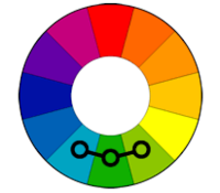
Analogous color scheme
These colors are next to each other on the color wheel. These colors create harmony by matching perfectly. Analogous color schemes are most commonly found in nature therefore, are usually filmed outside to capture the landscape setting.
Triadic Color Scheme
These colors are found evenly spread out into three points on the color wheel. This color scheme is really uncommon since it is difficult to work with. One of these is the vibrant color and the others are helping that color in the background.
Split-Complementary Color Scheme
This color scheme is similar to the complementary color in contrast scheme however, different when it comes to tension of the colors. Unlike complementary colors this scheme doesn't work with opposites. Instead of opposites on the color wheel, this scheme works with the colors next to the opposites.
Tetradic Color Scheme
Like the complementary palette, this scheme relies on opposites however, this time there are four points on the color wheel. With this being said there are so many possible combinations when it comes to this scheme. As per usual there is always one dominant color.
Since both of my main characters are opposite personalities I think I would need to work with a complementary color scheme. Therefore, both personalities are shown and moods are set for both sides of the story.


No comments:
Post a Comment